Has it already been two years since images of the “new American” first leaked on the web?
Warning: This post is a lengthy design rant and will impart no useful travel information or tips to anyone whatsoever.
I’m a bit late to the party, nearly two years late in fact. But all this talk of a soon-to-be-revamped AAdvantage program got me thinking about American Airlines’ “new look,” especially as it’s still being rolled out on aircraft liveries, frequent flier credentials, co-branded credit cards, and everything else you might associate with this great American airline.
What is this “new look” you ask?
Well, remember this:
![]()
I’m sure you do. This is American Airlines’ logo created in 1967 by design legend Massimo Vignelli, who, among other things, is Helvetica’s biggest fanboy. This is the logo that graced check-in counters and in-flight menus around the world for well over 40 years, becoming an indelible image of the glamour days of air travel for so many generations.
But things change. Our expectations change, and corporate logos change along with it. In 2013, on the cusp of its merger with U.S. Airways, American Airlines unveiled a new branding scheme to catapult the airline into the new and “modern” era of our time:
![]()
Reactions were mixed. Some praised this logo as embodying “the concepts of American pride and freedom wrapped into a shape that instantly makes you think about an airplane.” Others just said it looked like “a linoleum knife poking through a shower curtain.”
So which is it?
Well, regardless of what you think about American’s new logo, you must agree it makes you think. There’s a lot going on here, and I bet a team of well-paid design consultants spent many hours brainstorming what it means to be “American” and “an airline” while squeezing every word-map idea they came up with into one all-inclusive logo.
The end product is the kind of logo that makes art connoisseurs tilt their heads forward and “ooh and ah” at gallery openings. It causes consultants everywhere to lean back in their chairs and say, “Hmm, interesting.” And for everyone else, it rotates our heads ever so slightly to the side as we wonder what exactly this is.
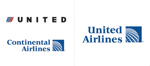
My initial thoughts? The logo isn’t bad. No, this is certainly no where near the abomination that the CEOs of United and Continental Airlines apparently put together with Powerpoint a few years prior:
But something about American’s new logo just seemed off. The problem was I had no idea what that might be.
I said there’s a lot of pieces to this logo, so let’s break it down. The people behind this design elevate the logo into the “Flight Symbol” and are sure to point out that it contains “the eagle, the star, the A” all in “refreshed shades of red, white and blue.” I’ll give them the colors, but let’s take a closer look at each of the symbols they mention:
- The eagle: I see two eagles here. One is a side-profile represented with the white and grey swoosh. The other, and this is a bit of a stretch, is the eagle in flight if you interpret the uneven red and blue trapezoids as the eagle’s wings.
- The star: Are they really trying to spin the eagle side-profile as a star? Because it doesn’t look like any star I’ve ever seen. Maybe a star with a gnarly hangnail on one of its points. What brand wants to be associated with hangnails?
- The A: I guess you kind of have half an “A” here. But unless you’re really into analyzing white space, I think we can write this one off as typical graphic designer puffery.
So I think it’s safe to say that the only proposed symbol reasonably represented in this new logo is the eagle. Interestingly, the logos’ creators say nothing about an aircraft tail, which I also think is fairly obviously depicted behind the side-profile eagle.
I must give props to the designers for trying to integrate multiple symbols into one. It kind of reminds me of Northwest’s old logo, one of my all time favorites:
But even with this newfound understanding and appreciation of the logo, I still couldn’t put my finger on what was wrong with it.
And then it hit me. It hit me like a ton of bricks, like a bad order of salchipapas hitting an untrained stomach, like whatever metaphoric cliche you prefer:
American Airlines’ design scheme was, and always should be, all about the eagle.
This new logo, on the other hand, completely eviscerates the eagle. It casts the primary symbol of American greatness as a mere afterthought in some misguided stab at modernness. In this logo, the once great American eagle is now a ghostly side-profile or an abstractly-constructed, Nemo-inspired seagull struggling to fly with its sadly incongruent wings.
Observe how American Airlines has evolved over the years:
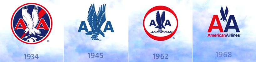
And now, take a look at the great American eagle of 2013:

Instead of placing the eagle front and center, American has reduced it to a silvery swoosh that embodies everything wrong with “modern” design today. Sure, minimalism is nice. And yes, streamlined and geometrical are both words.
But modern design was originally intended to emphasize the function and inherent characteristics of an object. It’s hard to argue that the unrecognizable bottle-opener-like thing above can functionally serve as an eagle when it hardly looks like one at all.
This design misstep is eerily reminiscent of one that took place in the far east:
Thankfully, the wise designers at Japan Airlines came to their senses (after flying for nearly a decade with the faceless JAL logo) and decided to revert to the classic crane design in 2011.
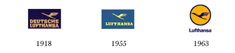
You see, when you’re dealing with something as instantaneously recognizable and deeply symbolic as the bald eagle (or the red crane in Japan), you should know not to mess too much with it. This doesn’t mean that the logo can’t change. It just has to remain faithful to the very thing that makes the logo great. The evolution of Lufthansa’s own crane is a great example of this:
An eagle is an eagle. A crane is a crane. A defining symbol should always remain so, and it shouldn’t be stripped of its identity in a desperate appeal to modernity.

Sadly, I don’t think American will change its logo anytime soon, especially since they’ve finally started rolling it out across their design ecosystem. But I predict the new logo won’t be nearly as timeless as its predecessor, and it’ll probably get phased out within a decade.
I certainly won’t miss it.
Finally, no discussion of an airline’s design would be complete without some mention of its livery.
Here it is:
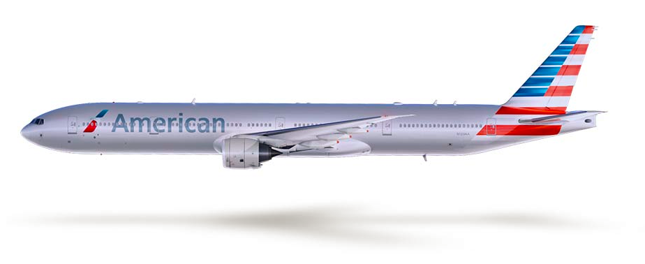
Not surprisingly, American’s new logo is at the fore-front along with the unfortunate HUGE SANS SERIF wordmark that seems to be all the rage nowadays. The matte silver coating, on the other hand, is nice and was actually a functional necessity since newer aircraft have composite exteriors that can’t accommodate the legacy metallic paint.
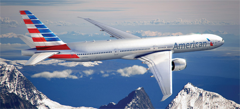
But the star of the show, of course, is whatever is going on here:
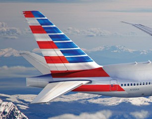
In a complete reversal from whatever path to minimalist enlightenment they were following to make the logo, American’s designers opted to go all-out in creating the world’s most patriotic airplane.
If Lufthansa’s livery is the symbol of German sensibility and Asiana’s is the belle of the ball, this one just claws for your attention by screaming “AMURICA!” every time it lands at an airport near you. The new American is the Bud Light-drinking, Marlboro-smoking, Smith&Wesson-toting weirdo of the group who refuses to be left out or forgotten. It crushes hot dogs for breakfast and french fries for dessert. It outraces F-22’s in the sky and shits F-250’s on the ground. It represents America at its finest and America at its worst, because it is truly and completely American through and through.
And you know what, I kind of like it.
The livery is unabashedly patriotic in a way that only American Airlines can be. It’s almost like the designers realized what a dud of a logo they came up with and scrambled to make up for it by shooting the Star Spangled Banner across every airplane they could get their hands on.
It balances using the extremes, a faceless logo with a completely over-the-top livery, but the overall end-product is balanced nonetheless.
Good job, American. You’ve made us proud.