It’s no secret that I think Delta has the best branding scheme of all the major US carriers.
That’s definitely a topic worthy of its own discussion. But for today I just wanted to take a closer look at some of the minor tweaks and improvements Delta quietly unveiled on its website this week.
Delta.com, while aesthetically pleasant as anything else Delta puts out, doesn’t exactly command the highest regard within the frequent flier community. Spotty award availability, ghost fares, and confounding error messages abound.
But yesterday, Delta took a step in the right direction by refreshing its website with a more user-friendly design and powerful reservations system.
Let’s run through the major updates in the order they come up during the booking process:
1. Toggle for date flexibility and award travel.
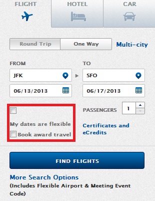
The first thing you’ll notice when you go to “Book a Trip” is that Delta has replaced its date flexibility and award travel check-boxes with these nifty two-option toggles.
Besides just being more aesthetically pleasing, the toggles presumably fix the stray check-box problem when viewing with a smaller screen-size, as seen above.
2. Search in 7-day segments for “Flexible Dates.”
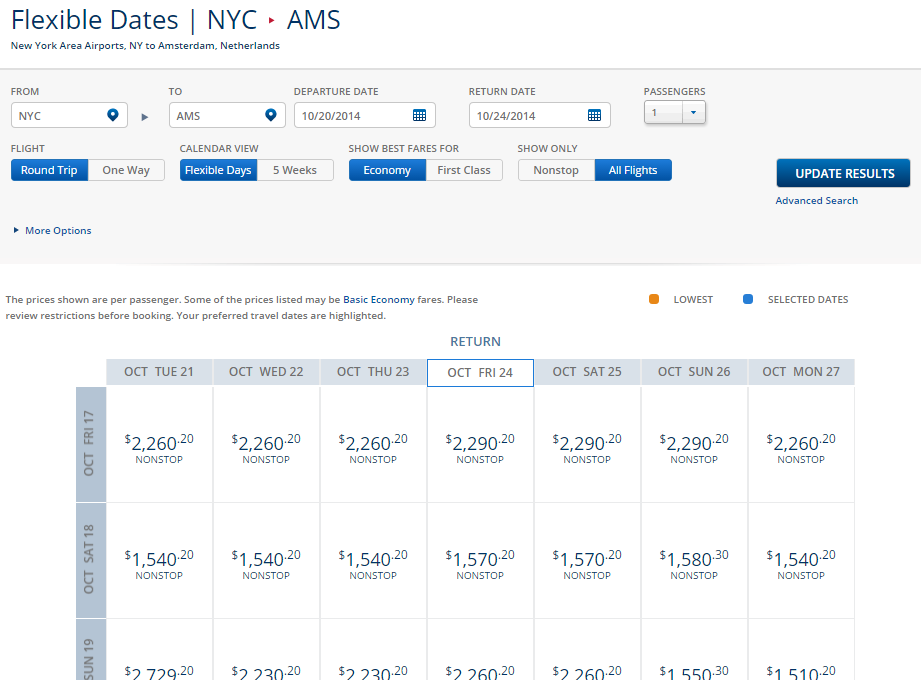
If you select “Flexible Dates” on the booking page, you’ll automatically search week-long segments centered around your departure and return dates.
It’s nice to see that Delta has finally caught up with its competition on this one. Previously, the website only searched in 2-day segments, creating sad little 2×2 matrices for round-trip fares.
3. Search by trip length in a one month period under the “5 Week” view.
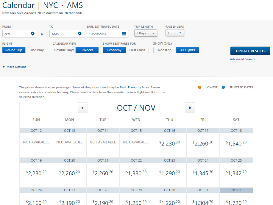
If you scroll up and click on “5 Weeks” under Calendar View, Delta will bring up an ITA-esque calendar that shows fares based on whatever trip length you originally selected.
This search capability isn’t as powerful as ITA Matrix since you can’t search a range for trip length (e.g. 0-7 days). But it’s interesting to note that Delta is currently the only US airline that offers this month-view of fares on its website. Will others follow suit?
4. See a prettier and more informative flight selection.
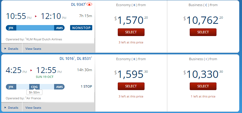
Besides tweaking the fonts on the flight selection screen, Delta now clearly displays layover length in a nice little itinerary “capsule” right below the flight times.
Delta’s graphics team, or a well-paid outside consultant, is also dabbling with lighter hues of blue, most prominently illustrated with the new royal blue that graces the background of nearly every page in the booking process.
So why does this matter?
It doesn’t, really. People who book exclusively on Delta.com might appreciate the subtle changes on the flight selection page and the more powerful “flexible dates” search, but most are still better off using ITA. The new colors, fonts, and design lay-outs are inconsequential for most and will probably go unnoticed by many more.
But it’s still nice!
Especially with so many airline logos and brand identities being completely botched, rendered faceless, or mindlessly subscribed to this HUGE SANS SERIF FONT TREND in recent years, I’m glad to see that Delta still cares about its minor design elements.
Now if only they’d fix their award booking system ..


