Earlier this week, Amazon rolled out changes to their Amazon Seller app. I call these changes because, I’m not entirely sure they are all enhancements. There are some new features though, which I’ll also cover in this post. You can see what the Amazon Seller App used to be like here and here.
User Interface Changes
Most of the changes to the Amazon Seller App appear to be more focused on the User Interface, and ultimately, the user experience. They moved some things around, and provide more detail and functionality on the “Home” screen. The below graphic shows the differences.
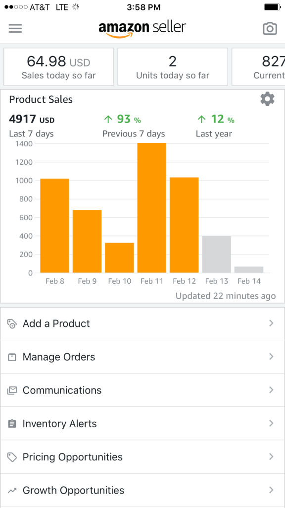
You’ll notice that there’s more information here. There are a few things I’d like to point out below.
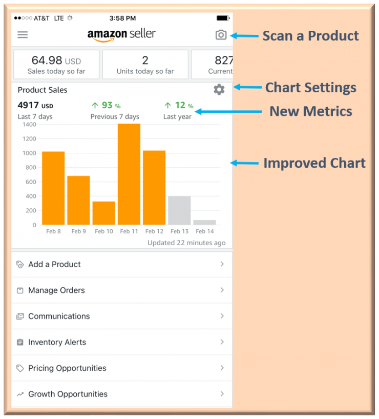
Of particular note, the “Scan” button has been removed from the bottom, and instead resides in the upper left.
At the top there is a slider, where you see your sales for the day, number of products, current balance, next payment (all standard), and adds your Customer Feedback rating. I find that I don’t monitor my rating terribly often, so the functionality on the Amazon Seller App seems to be excessive, but I can understand how others might prefer that. I generally find customer feedback and my seller rating to be most easily managed from Amazon’s Seller Central.
An additional interface change of note, is the removal of a number of key functions from the menu bar on the right.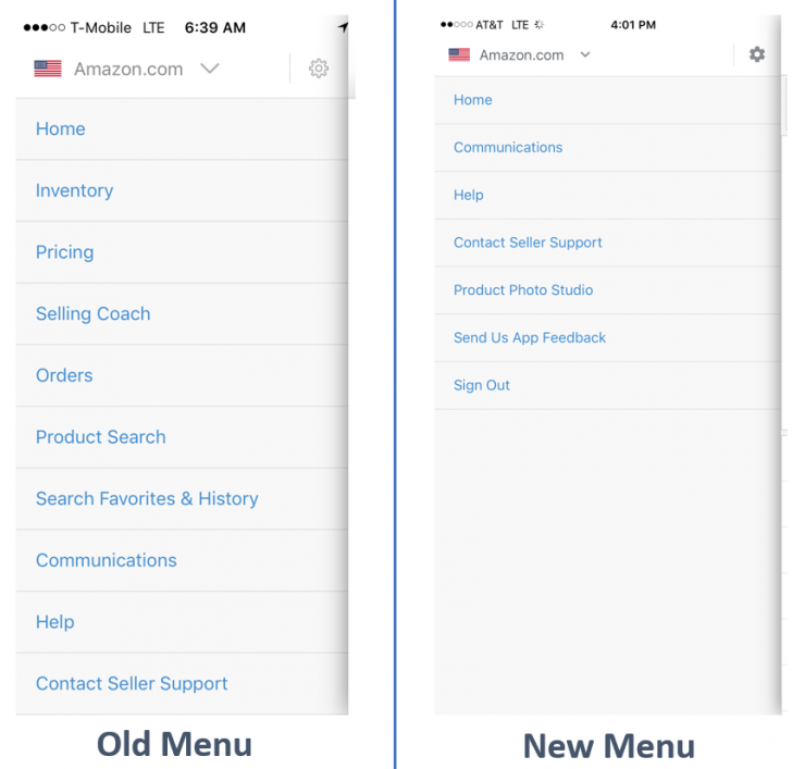
This could impact folks, I know it is impacting me and some of my workflows.
Amazon Seller App Enhancements
With any change, there are usually enhancements. I use this word almost like I would use for an Loyalty Program’s Change since Amazon acts unilaterally, like loyalty programs. In this case, most of the increased functionality seems to be in the data analytics of 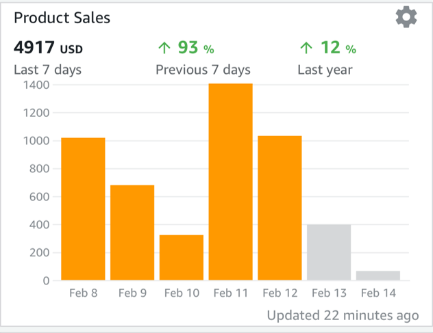
Historically, you could orient the graph to show you month or week, and dollar sales or unit sales. Now you can see a few more options in the screenshot below:
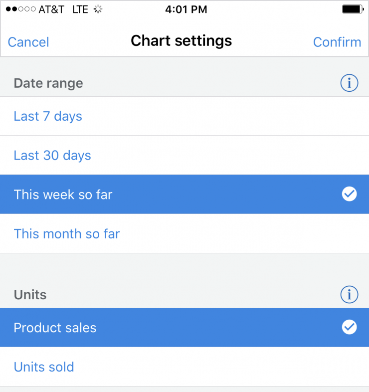
I’d imagine that this is beneficial for folks that like to slice the data in multiple ways.
Additionally, you can click on a particular bar, and do further analytics by day.
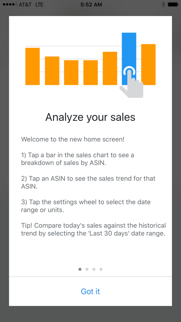
Again, interesting for those that like to do more data analytics on their phone.
Initial Feedback
I haven’t played around with the app too much, but others on twitter that have weighed in, have highlighted the app’s increased penchant to crash. My personal experience was that it seemed to be a data hog, and without a strong data connection, it was barely functional. In some of the places I source, I usually find that I have a single bar of signal, so this is a particular concern for me. That said, I think things are still pretty new, so it may be too soon to tell.
Conclusion
I’m glad to see that Amazon is continuing to improve the Amazon Seller App. I feel like in this case, they may have taken away some functionality that can be useful, and the new functionality, while nice, provides for a challenged experience. I think more data is great, but, to the same point, the point of the Amazon Seller App, in my opinion at least, is to facilitate sourcing and some business management functions. You have never been able to create shipments in the app, for example. That said, I’m not entirely sure why Amazon is enhancing the analytics, when there are other areas that they could be enhancing in the app, like enhanced recognition when scanning, perhaps an option to store data for faster scanning, list functionality, and more functionality in the “Inventory” menu, like a link to the listing within the app.
What do you think about the enhancements? Do you find the data analysis addition of particular value?
Most of the menu items that were removed are on the Home screen. Was it easier to pull up the menu? I know the Home screen takes time to load and it used to be possible to get into some of those functions previously without waiting for data.
They have promised adding shipments, but that is a very complex procedure for a tiny screen (even a tablet).
They could improve scanning by incorporating their Flow functionality. But they seem conflicted about RA right now.
Overall I am pleased with the app but I do use it less for sourcing than the other features.
@Dave, I have a post that I’m drafting that highlights the how much easier it is to use the menu items rather than the home screen; in addition, the back button is much more useful, in that you can go “back” to a different menu item, vs. starting fresh each time. If you do a lot of repricing from the app, its a noticeable increase in effort.
I figured everybody uses the apps a bit differently. I always wondered why they chose to put options where they did in the old app. Interesting that the communications option appears in both places, but has different views.
I am old school, prefer to use a computer for managing my seller account. It’s much faster and screen size allows for more data.. The apps are okay for quick tasks. It’s annoying that the filters aren’t sticky. When I get a view the way I need, it resets!
I can certainly see your point now about repetitive use. I look forward to your future post about the app.
@Dave – I totally get the idea of using a computer to manage your seller account. For me, I travel a bunch (perhaps you have noticed, lol), and more often than not, I find it significantly easier to managed my business from my iPhone Amazon Seller App. The new app will make it much harder, and may very well force me to be less agile, or, leverage third party applications. I’ve got a post that will go live soon, to show you just what kind’ve workflows I do on my Amazon Seller App.
Pingback: Travel on United's new Polaris, AirAsiaX coming to America, FT4RL6 Speakers - Tagging Miles
Pingback: Recap: New e-Visa For Vietnam, Travelling To Every Country & More - Doctor Of Credit
Pingback: Why I’m not a fan of the Amazon Seller App enhancements - Tagging Miles