I finally got around to checking my spend using Mint, and ran a quick and dirty this year vs last analysis. It seems that despite it being the end of days, things aren’t that bad.
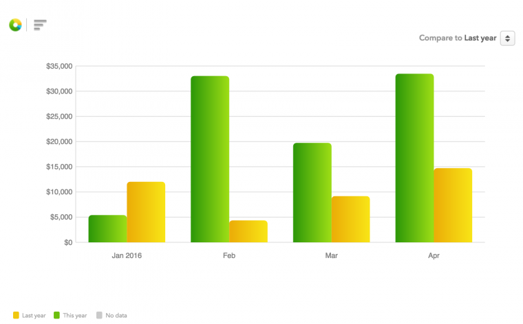
Year on Year spend
A couple of notes:
I don’t resell. I know it is fantastic, but I’ve decided to focus on other things. For example, I recently bought a course online in order to gain another professional designation. Real spend, an increase in outflow, and with a future recurring ROI.
For MS, I only bought giftcards once this year to max out an EDP $6K. Total monthly MS has certainly dropped, though it was never very time consuming, I’m hoping to bring it under 30 mins a month going forward.
Does it matter?
I was thinking to granulate the chart into real vs ms spend since my ‘real real’ spend (personal spending) is very low. However, I don’t see a huge value in tagging everything to achieve that. Further, the limitation to earning is what you do with the funds.
The charts show spend, but they don’t show what was earned (at what multiplier) or how they were burned. These double leverage points change a month like April with a $33K spend into anything from $660 gross to 165000 ultimate rewards redeemed at 4 cents each for $6600 in freee travel. It also doesn’t show how many min spends were met on the way there, some months might include 100K of points earned at $6K in spend.
And then does the earning and burning even matter if the results were not spent wisely – what if my $6600 in travel was spent on the plane and to the Park Hyatt somewhere where I ordered nothing but Cheese Burgers?
The whole inflow/leverage/outflow thing is a strange beast indeed, so the chart ‘is what it is’. What I do like about it is that we can help drive the notion of spending more via real spend, which is all too often forced into the reselling category, but could be a lot broader if we allow it to be.
The post YTD Spend 2016 vs 2015 appeared first on Saverocity Travel.
Continue reading...
Last edited: