There’s one of those charts out there again.. you know the ones – they are written up and then they go viral and people forget to actually care about how accurate they are, or what they are say, they just go WOW IT IS A CHART (hereafter referred to as #thechart). This one was in Business Insider, check it out.
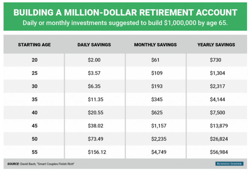
#thechart
The spirit of the chart
The ‘spirit’ of #thechart is to highlight the time value of money. This is a very powerful topic, and one people should certainly learn, however, someone took a few liberties with the message, and now it is not only unrealistic, but also incorrect, which is a shame.
Time Value Money (TVM) Basics
The purpose of #thechart was to show how saving sooner would require less amounts of inflow to achieve the goal of $1,000,000. IE they are suggesting that people save more, and start younger. But to illustrate that point they kinda fudged the numbers a bit.
Since you can see Time (starting age) Present Value (starting with zero) Ending Value (ending with $1M) and Payment Periods (Daily vs Monthly vs Yearly) the number that was ‘goosed’ was Interest Rate. I’d love to say with certainty how they did that, but to be frank, I looked at age 20 numbers, and they all used a different Interest Rate, so it’s a mystery to me, I’ve not the foggiest what is going on.
So its a case of there are 3 numbers, and they are all different, because they all have different Interest Rates (they vary from 11-12%) the reason for this is likely down to the improper understanding of Time Value of Money (ooops!).
Age 20 Data
Is it OK to have a little artistic license?
AKA, why is this a big deal? Well, for one, the rate is unrealistic, so you are telling (providing financial education) people to do something, but its going to go horribly wrong for them. When that does, who can they trust? I’m also kinda bothered by the complete lack of financial savvy shown in the other Axis of the chart. The author just screws up and in doing so shows a massive lack of understanding of TVM.
The Blatant Lack of Understanding
The message in #thechart is saving sooner (younger) is better because of TVM (you’ve heard it called compound interest too). But what is the difference between saving daily, monthly and annually? Daily is sooner than Monthly, which is sooner than Annually. You have TVM running on both the X and Y axis, but it is missed. You can’t get your annual number by multiplying daily by 365. Thats not how compound interest and TVM work.
Here’s what the real numbers should be, assuming a 11.20% Interest Rate (which is insanely high…)
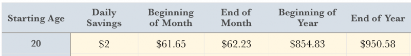
real numbers using 11.20132%
If you look at the monthly amount, it seems ‘pretty close’ so could be dismissed as a rounding error, but when you shift to annual payments you really get to see TVM as it should be. The lesson it shows here is that saving sooner (in the year) means you need to save less.
Pro Tip – you can contribute to your IRA on January 1st, it could be the full amount, or just whatever money is spare, as you can contribute many times during the year. Getting your money to work for you earlier each year, really helps.
As for the $730 per year number provided by the chart? I don’t know, it creates a figure of around $768K if you save at the end of each year, or $854K if you save at the beginning of each year. It’s quite a shame that #thechart is so popular, when it shows not only an unrealistically high interest rate, but also such a blatant lack of understanding of how TVM works that the numbers are just plain wrong.
Last up don’t forget reversion to the mean!
TVM calculations like the ones I used above lack sophistication in that they assume a constant interest rate. If your rate is anything above a fixed rate (which would make it more like 3% for that sort of duration right now) then you must understand that the number you use is an average. Annual returns are variable, and the theory is that over time, things will become ‘averaged out’ and revert to their mean. What this ‘means’ for this chart is that using anything above a fixed income rate creates more risk from standard deviation or portfolio Beta when timelines are shortened.
In other words, if you do start your path to saving a million at age 55 be prepared for any given year to reduce your balance by up to 50% rather than add a magical 11.20132%.
Takeaways
If you really want to know what you will need to save, just go to an online compound interest calculator, here’s a basic one at MoneyChimp. Remember saving earlier doesn’t just mean younger in years, but that in any given year you are younger and older

The post What’s up with #thechart ? appeared first on Saverocity Finance.
Continue reading...
#thechart
The spirit of the chart
The ‘spirit’ of #thechart is to highlight the time value of money. This is a very powerful topic, and one people should certainly learn, however, someone took a few liberties with the message, and now it is not only unrealistic, but also incorrect, which is a shame.
Time Value Money (TVM) Basics
- Time (duh)
- Interest Rate
- Present Value
- Ending Value
- Payment (per) Period
The purpose of #thechart was to show how saving sooner would require less amounts of inflow to achieve the goal of $1,000,000. IE they are suggesting that people save more, and start younger. But to illustrate that point they kinda fudged the numbers a bit.
Since you can see Time (starting age) Present Value (starting with zero) Ending Value (ending with $1M) and Payment Periods (Daily vs Monthly vs Yearly) the number that was ‘goosed’ was Interest Rate. I’d love to say with certainty how they did that, but to be frank, I looked at age 20 numbers, and they all used a different Interest Rate, so it’s a mystery to me, I’ve not the foggiest what is going on.
So its a case of there are 3 numbers, and they are all different, because they all have different Interest Rates (they vary from 11-12%) the reason for this is likely down to the improper understanding of Time Value of Money (ooops!).
Age 20 Data
- Save Daily $2
- Save Monthly $61
- Save Annually $730
- $730/12 = $60.8333333 (rounded to $61)
- $730/365 = $2
- Time (45 Years*365 Periods)
- Interest Rate (pulled out of the air/we’re working on it)
- Present Value (zero)
- Ending Value (1 Million Dollars)
- Payment/Periods $2
Is it OK to have a little artistic license?
AKA, why is this a big deal? Well, for one, the rate is unrealistic, so you are telling (providing financial education) people to do something, but its going to go horribly wrong for them. When that does, who can they trust? I’m also kinda bothered by the complete lack of financial savvy shown in the other Axis of the chart. The author just screws up and in doing so shows a massive lack of understanding of TVM.
The Blatant Lack of Understanding
The message in #thechart is saving sooner (younger) is better because of TVM (you’ve heard it called compound interest too). But what is the difference between saving daily, monthly and annually? Daily is sooner than Monthly, which is sooner than Annually. You have TVM running on both the X and Y axis, but it is missed. You can’t get your annual number by multiplying daily by 365. Thats not how compound interest and TVM work.
Here’s what the real numbers should be, assuming a 11.20% Interest Rate (which is insanely high…)

real numbers using 11.20132%
If you look at the monthly amount, it seems ‘pretty close’ so could be dismissed as a rounding error, but when you shift to annual payments you really get to see TVM as it should be. The lesson it shows here is that saving sooner (in the year) means you need to save less.
Pro Tip – you can contribute to your IRA on January 1st, it could be the full amount, or just whatever money is spare, as you can contribute many times during the year. Getting your money to work for you earlier each year, really helps.
As for the $730 per year number provided by the chart? I don’t know, it creates a figure of around $768K if you save at the end of each year, or $854K if you save at the beginning of each year. It’s quite a shame that #thechart is so popular, when it shows not only an unrealistically high interest rate, but also such a blatant lack of understanding of how TVM works that the numbers are just plain wrong.
Last up don’t forget reversion to the mean!
TVM calculations like the ones I used above lack sophistication in that they assume a constant interest rate. If your rate is anything above a fixed rate (which would make it more like 3% for that sort of duration right now) then you must understand that the number you use is an average. Annual returns are variable, and the theory is that over time, things will become ‘averaged out’ and revert to their mean. What this ‘means’ for this chart is that using anything above a fixed income rate creates more risk from standard deviation or portfolio Beta when timelines are shortened.
In other words, if you do start your path to saving a million at age 55 be prepared for any given year to reduce your balance by up to 50% rather than add a magical 11.20132%.
Takeaways
If you really want to know what you will need to save, just go to an online compound interest calculator, here’s a basic one at MoneyChimp. Remember saving earlier doesn’t just mean younger in years, but that in any given year you are younger and older
The post What’s up with #thechart ? appeared first on Saverocity Finance.
Continue reading...
Last edited: