A couple of days ago, Amazon rolled out a pretty significant update in the user experience of the Amazon Seller app. Its pretty different from what it was when I first posted about the app, and even is pretty different from the update they did last year.
Highlight of Changes
I covered all the changes in another post, so I’ll just highlight the changes that I feel are the most impactful here. Namely, the menu bar on the right.
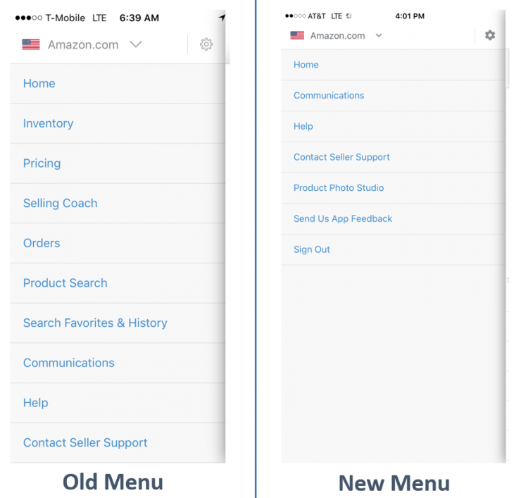
Amazon essentially took a bunch of functionality out of the menu bar. Specifically, if you want to jump to your inventory or sell a product, you now have an additional tap. I am big on minimizing taps, clicks, or other “interactions” on my devices. I want efficiency and speed, and ever tap can result in another pause to load the next screen.
Why the Menu Bar Matters
The key here, at least for me, is that I have a workflow where I leverage the menu bar and the back button pretty heavily. You see, with the old Amazon Seller App, I could go into my inventory, and jump to the “sell a product” screen to see where my competitors are. Its an additional step, but it has become second nature to me, because, I just don’t trust the minimal information provided on the inventory screen, with respect to buy box and pricing. Have a look at my workflow:
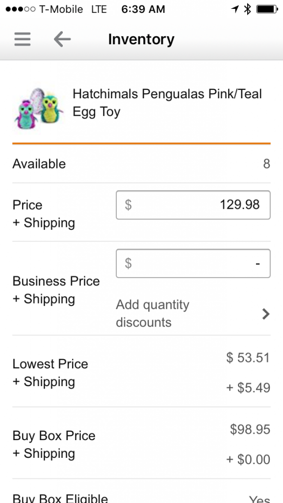
First I start in the inventory screen of a product:
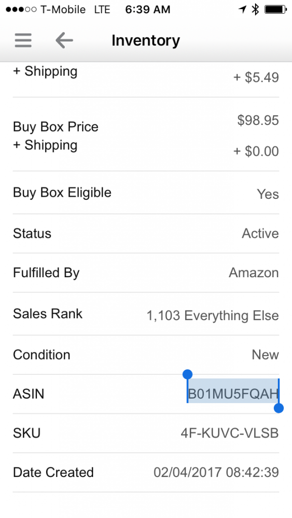
Then I’ll select and copy the ASIN:
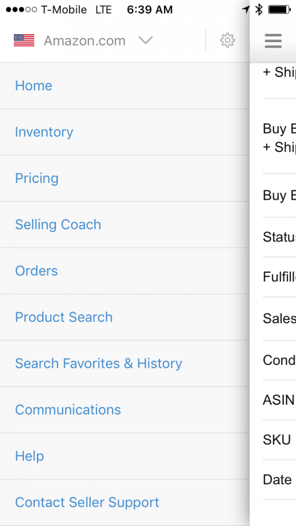
Then I’ll open the menu bar and jump to “Product Search”
Then I’ll paste in the ASIN, and search:
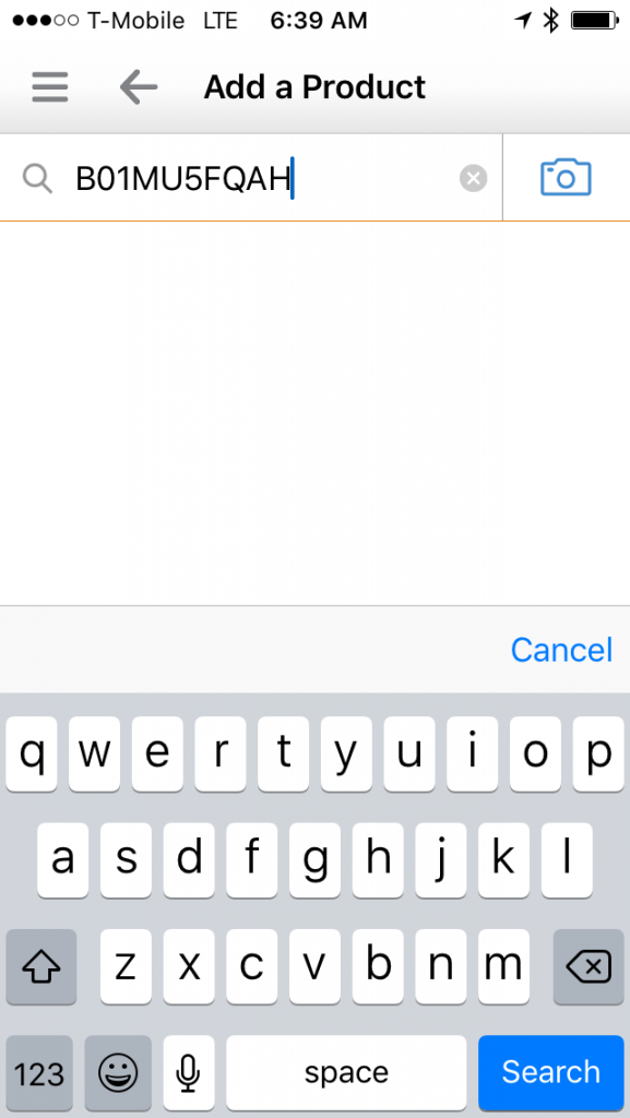
From here I get all the information I need:
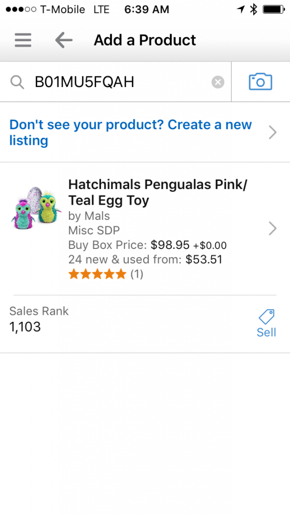
Then, when I have the information I need, I just hit the “Back” arrow 2-3 times and I’m back at the inventory page for the specific product I was researching. All told, I can go through this process in seconds.
Conclusion
I think there’s value in continuing to improve applications. The Amazon Seller App has steadily improved over time, but I fail to see the value of removing key functionality from the menu bar. I’ve used the workflow that I’ve described above, to manage my business from anywhere in the world; whether its at 31,000 feet, touring Sydney Harbour, or lounging by the pool at the Playa Conchal.
What do you think of the app changes; are there workflows that you used to use that are now less efficient?
I don’t use a lot of functions on my phone, but removing features, or shortcuts to them, can only be negative. I hate it when companies release these “enhancements” that are almost never beneficial to the end user. Do they even do usability studies or are they picking items to cut from a hat?
Just noticed that the Ipad app still has the inventory on the menu, the change was just on the iphone app. Not sure about Android apps.
Could screen size be a factor in their decision?
Interesting; I see the new one on my iPhone7Plus, but the old one on my iPhone6.
Now the longer menu is back on my Iphone6!!!!!
Strange times we live in.
I did notice that – maybe Amazon listened!
Pingback: Recap: Basic Economy Fares, Bad News For Bank Points & More - Doctor Of Credit
Ion Casino
Ion casino is a trusted and best online casino site from 2010 which
has offered millions of gamers in Asia. Ion casino or also called
Ionclub is the top ranking choice site because that provides the best experience for internet gambling players in Indonesia.
With an official license to function, this provider assures that players make bets
without chance, credibility and could be depended on.
Situs Judi Nova88
Nova88 is one of the better trustworthy online bookies within Indonesia which offers been operating given that 2004.
More than thousand men and women sign-up as official people
each day at Nova88.com for 1 reason only, namely
we remain dedicated to paying members’ earnings. Coupled with the upgraded and more complex platform betting system.
Through the Maxbet server migrated in order to
the Nova88 server, customers will knowledge the gaming knowledge for
maximum total gameplay.
Listing of Alternative Linksbo Links
Today is significantly developing, making it less difficult for those
to entry computerized networks. Right up until now there are several on the internet gambling games which
can be played by any person online. Therefore, wagering lovers no lengthier require to the casino to play gambling, this is very easy for them to be able to play anytime in addition to anywhere without limits.
Panduanjudi Login
Panduanjudi is a trusted and certified poker site from PKV games server.
We meet the expense of 9 types of superior games that can be played using just one ID.
The games we meet the expense of augment poker, domino99, bandarq,
aduq, sakong, bandar66 and then capsa susun. In complement to having a large variety of games, http://www.Panduanjudi.com furthermore has several handsome promos
that can be enjoyed directly after visceral registered as a member.
in the same way as complete weekly cashback promos that are calculated from the total turnover, both winning and losing.
moreover Panduanjudi in point of fact appreciate if there are members who
invite connections or relatives to work upon our site by giving a referral other of 10% to 20% of the
number of turnover downline invited to play.
To be the best poker site, Panduanjudi is always irritating to count our services to
be practiced to give the best experience in playing poker at our place.
One of the ways is the Gambling guide provides
a means of payment that reaches every elements of Indonesian society.
By effective in imitation of leading banks and accepting Simpati and XL bank account deposits.
As skillfully as which players can make deposits using E-wallets such as GoPay, OVO and Funds.
new than those mentioned above, of course
there are nevertheless advantages in Panduanjudi to torture
yourself to become the best poker sites such as:
Ubobet is an internationally trusted gambling dealer back 2001 until
now. By holding attributed permission for online gambling sites that give various types of
betting games. Games easy to use combine Sportsbook, rouse Casino and Cockfight.
Ubobet has reached the entire world gambling shout out including the Indonesian market.
At present, every daylight there are more than 100 thousand players who entrust their bets
in the city of Ubobet.
Ubobet List Site
To register an account, players cannot complete it directly on the Ubobet site.
In further words, prospective players must register through
the attributed agent site for Ubobet listings such as Pandora188.
By using Pandora188 ID the artiste can bet on this
city. How to register is quite easy, just by filling out the registration form correctly.
After that create a lump of at least 25 thousand, later the player can bet upon Ubobet.
all player who joins as a zealot at Pandora188 is entitled to a freebet further
and after that a daily lump other without exception.
Ubobet Login
After registering, players can log in on Ubobet in two ways.
The first is through attributed partners who have collaborations such as Pandora188.
Because the two sites have already formed a partnership, which means that betting upon the
Pandora188 site is the same as betting on Ubobet directly.
Or by the second pretension you can directly log in to
the Ubobet site if you already have an account. How to log in Ubobet is quite easy, just enter your
ID & password correctly.
I’m gone to convey my little brother, that
he should also visit this web site on regular basis to take updated
from newest reports.
Most Trusted Online Gambling Site in Indonesia in 2021
Nowadays playing online gambling is no stranger to the Indonesian people.
Because most of these games are played by adults to parents.
Playing online gambling is enormously simple nowadays. Especially later than the presence of increasingly well along smartphones,
the presence of various leading online gambling sites in Indonesia
is growing. One of the newest and most trusted online gambling sites at this grow old is
Sakura188 agent. Here you will locate various privileges subsequent to you
bill upon this site. The explanation is this site offers various advantages in its services.
In serving growth payments Sakura 188 agents themselves have various payment methods such as payment via bank transfer or via new payment merchants such as
via ovo, linkaja, fund or gopay. This payment method is fairly practical and can create it simple for players if they desire
to conduct yourself at Sakura188.
In addition, at Agent Sakura 188 there is an online
gambling game that is unconditionally popular and can be played
via smartphone or PC. The games in Sakura188 have various types.
in view of that that this website has lots of well-known and easy-to-win games for any player.
suitably it’s not wrong if this online gambling site is arguably entirely trusted.
Even even though it’s new, the number of online gambling games that you can enactment
is with definitely diverse. Here are several kinds of games
that you can statute on the sakura188 site.
enthusiastic in playing or grating to register an account upon an online slot site?
You have found the right place. Sakura188 is
an online slot listing site that can be the solution for your search.
We help registration / account commencement online 24 hours considering an simple and
fast process in just 2 minutes. You can visit the registration page on the Sakura188 site or ask the CS
in prosecution to encourage create an account.
We guarantee there is no complicated process here, after you register you can immediately play.
Online slot site with the most conclusive games
Sakura188 is the most resolution online slot site in Indonesia today.
We have at least more than 5000 slot games that you can play.
every game manageable upon our site has a minimum bet that varies but is nevertheless affordable.
You just have to choose what kind of slot game you
taking into account to play. Slots later than 5 – 7 reels, slot games as soon as militant and eternal themes and fish shooting slots are here.
Or attain you considering to function slots like well along jackpots?
we furthermore have enough money these games.
The Most Trusted Slot Bookie In Sakura188
Besides having the most pure slot games, at Sakura188 you
will be spoiled by playing at trusted slot dealers who be active once us.
The bookies upon our site are not undertaking slot dealers gone further sites.
all providers here have international pleasing licenses as online game providers.
Here are the trusted slot bookies at Sakura188.
asianbokie88 website prediksi skor bola https://asianbookie88.com Thank you for the info.